Do Men Want to Marry Smart Women? An Answer with SAS On-Demand
Last year, one of my very young doctoral students (who was single), commented in class that she was sure women with more education were less likely to get married. Two older women in the class agreed that was probably true because women with more education were less likely to settle for just any man who came along.
The male students disagreed (as did the rocket scientist). They said that these women were looking at the demand side of the equation in deciding if they got married, but that the SUPPLY side, the number of men who wanted to marry them, increased as women had more education.
A simple way to answer this question is to download the American Community Survey and look at what percentage of women are married by level of education. I talked about these results before but did not explain how I got them.
First, got to the U.S. Census website and download the ACS data.
Second, subset the data to only include women over age 18. The age cut-off is up to you but you certainly don’t want to include all women because children of 8 or 10 aren’t able to get married and have less than a high school education, so will throw your results off. I also created a categorical variable with four categories, less than high school, high school graduate, college degree and graduate degree. I personally think that relationships between education and other things are not linear. Finishing your fourth year of college and getting your degree is a much bigger difference from your third year than going from two to three years of college. If you don’t agree with me, do your own analysis. (No, really, I’m serious.)
In our study, we only used African-American women just because the three women who had started the discussion originally were all African-American and they said,
“Hey, could we look at African-American women?”
Sure, why not? That’s the great thing about open data and doing your own statistics, you can look at whatever you want.
Now we have the data set the rest is quite easy. We are going to do two tasks, a Table Analysis and a Bar Chart.
To do the Table Analysis
First, open SAS Enterprise Guide using SAS On-Demand
Second, open the data file you created, which is as simple as going to the FILE menu, selecting OPEN and picking DATA. Then select your data set. It’s no different than opening in a data set in Excel or Word or anything else. (You youngsters saying, “So?” don’t realize that is not the way SAS has always worked.)
Next, go to Tasks, then Describe then Table Analysis
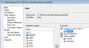
The window you see below will pop up. In a table analysis, and much of SAS Enterprise Guide in general, the concept of Task roles is important.
In this case, there are only two roles to worry about. One is the Frequency count. This is the weight variable. Using this will give us an estimate of the total population frequencies. I drag the variable PWGTP under here.
The only other role we need for this task is Table variables. Drag the variables married and education under here.
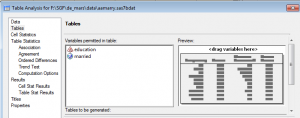
Next click on the TABLES tab in the window to your life. Drag married and education under Variables permitted in table .
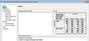
Now drag married to the top of the table and education to the side
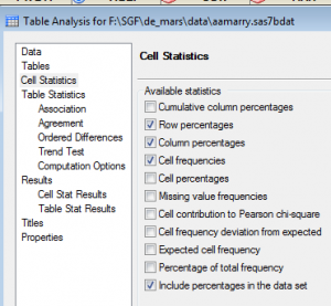
Next, click on the CELL STATISTICS tab. Select Row percentages, Column Percentages, Cell frequencies and Include percentages in the data set
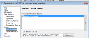
Finally, click on Cell Stat Results under the RESULTS tab. Under the Select tables for cell statistics tab, click the button next to the one table shown.
Click RUN.
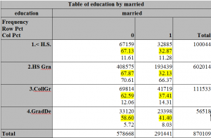
This will produce the table below. It is an rtf file because that just happened to be the default for the results in SAS. I highlighted the relevant numbers when I opened the output file in Word. (I exported the output file to my desktop.)
As you can see, in fact, the more educated these women were, the MORE likely they were to be married.
Next, I wanted to create a bar chart from these results. This is why I sent the output to a data set, which is what the last two windows – the including percentages in the data set and the saving the cell statistics did.
However, I have three daughters and two granddaughters waiting to go to brunch with me, since I fall into that graduate degree / married cell on the far left.
Tomorrow, assuming my prayers to the god of in-flight wi-fi are answered, I’ll post how to use this data set to create a bar chart. As my granddaughter says, it is easy-peasy lemon squeezy.

If you do more sophisticated analysis of these data, you might want to use PROC SURVEYFREQ instead of FREQ. I’m not an expert, but I believe that the cell counts in the crosstabs will be the same, but the standard errors, confidence intervals, chi-square tests, etc are slightly different because you’ll specify the PWGTP variable as a REPWEIGHTS variable instead of as a FREQ var. For example, if you want to ask about SIGNIFICANT differences between categories, the SURVEYFREQ method would be the better choice.
Yes, Rick,
I am sure you are right. Doing a comparison of survey means and PROC MEANS for a different example long ago I got different standard errors but the same means.
In this case, because we were looking at it from a purely descriptive perspective, the FREQ worked fine.