Box and whisker plots – they’re not just fun to say!
Box and whisker plots can give you an understanding of your data at a glance – IF you know what you’re looking at.
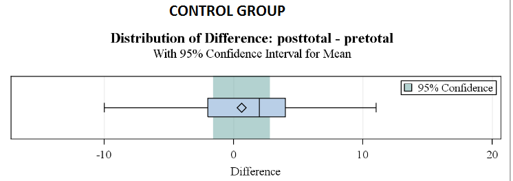
The BOX extends from the 25th percentile to the 75th percentile. That line in the middle is the median, also known as the 50th percentile. The diamond inside the box is the mean. The whiskers, those two lines at either end, extend from the box as far as the minimum and maximum values, up to 1.5 times the inter-quartile range. The inter-quartile range is the distance from the 25th percentile to the 50th. In other words, each whisker MAY extend up to 1.5 times the length of the box. (Different software packages use different values for the whiskers. This is what SAS does.) If there are any outliers beyond 1.5 times the inter-quartile range, they’ll be shown as asterisks after the end of the whisker. In the t-test output, SAS also shades an area for the 95% confidence interval.
The example below is part of the output from a t-test task in SAS Enterprise Guide. It is from the control group in our pilot study of Spirit Lake: The Game. The value plotted is the difference between post-test and pretest. So …. you can see that the mean difference between pre- and post-test for the control group was close to zero. The median was a little bit above zero. There are no really extreme outliers, and the distribution is a little skewed to the left, with the mean to the left of the median. The most extreme difference for the control group was an increase from pretest to post-test of 11 points. We can also see that zero falls squarely in the middle of our 95% confidence interval, so we can accept the null hypothesis that no significant increase in performance on the math test occurred for the control group. This isn’t really unexpected – you wouldn’t really anticipate large improvements in mathematics performance over only eight weeks.
Let’s take a look at another box and whisker plot, this time for our experimental group in the same study.
We can see right away that the whole distribution has shifted to the right, and this time it is skewed to 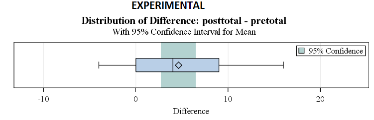 the right. The median looks to be at about four points higher on the post-test and the mean is above that. The 25th percentile is at zero, in other words, 75% of the students showed some improvement from pretest to post-test. The 75th percentile is a nine-point improvement for the experimental group, versus three or four points for the control group. It can also be seen that zero is not within the 95% confidence interval, not even particularly close, so we reject the null hypothesis that there was no improvement for the experimental group.
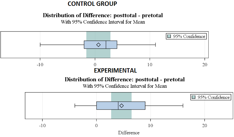 If we line the plots underneath each other, with zero at the same point, it is particularly easy to see that the improvement in scores from pretest to post-test for the group who played the game was noticeably higher than for the control group.
So, there you have it, a couple of brief looks at the data improves your understanding of the results.
I’ll apply this idea…… It can be fun!