SAS Enterprise Miner, The Good Parts
After all of the effort to get Enterprise Miner installed, I thought it better do something good. It is interesting to use. Unlike programming where you can get a program to run but give you errors or unexpected results, so far (key phrase!), with Enterprise Miner I have found the problem to be knowing exactly what to select, for example, with CREATE DATA sources. Once you know that, however, it seems pretty hard to make an error.
 Enterprise Miner does do some pretty cool stuff, which makes it worth the pain of getting it installed. Even way cooler, unlike back in the day when no one could get their hands on it without paying approximately $4,893,0893.16 , their first born child, their left kidney and an albino goat, if you are an instructor or a student, you can get it for free through SAS On-Demand for Academics.
(And, yes, for the record, I *am* aware that said goat is not an albino. I was fresh out of pictures of albino goats. Deal with it.)
Speaking of Enterprise Miner, I thought I would ramble on about the good parts for a few posts, since I’m getting ready to teach data mining in the fall and I hate to do anything at the last minute.
One of the good parts is StatExplore. At first glance, it looks good, but at second glance, it looks better.
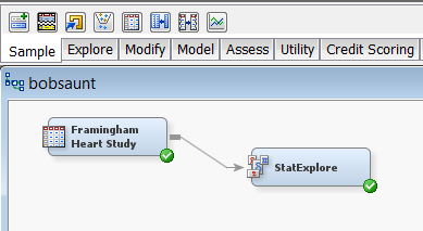
All you need to do is create a diagram by going to the FILE menu, then selecting NEW and then DIAGRAM.
You can start by dragging a data source on to the diagram. In this example, I used the heart data set from the Framingham Heart Study, which happens to ship with Enterprise Miner in the SASHELP library.
I drag the data set from data sources to the diagram window.
Next, I click on the EXPLORE tab just above the diagram window. This gives you a bunch of icons. Enterprise Miner is just rife with icons. Never fear, though, if you have no idea what this bunch of colored boxes is supposed to mean versus that bunch, just hover over the icon with your mouse and it will tell you.
Here is my diagram. Simple, no? It gives you a bunch of cool stuff. First, you have the plot of chi-square values for all nominal variables.

You can see that sex has the highest chi-square (as in gender, not as in frequency of), followed by cholesterol status, smoking status and weight status. I find this rather surprising. I knew women lived longer than men, but with all of the discussion of obesity, I thought weight would be higher up there.
The next chart gives me the worth of each variable in predicting my target, which in this example is death.

The variable on the far left is age at start. Not surprisingly, the older people are when you start following them, the more likely they are to die in a given period of time. The next variable is Age at CHD Diagnosis, followed by two blood pressure measures, their cholesterol, then cholesterol status – weight status is down at the end.
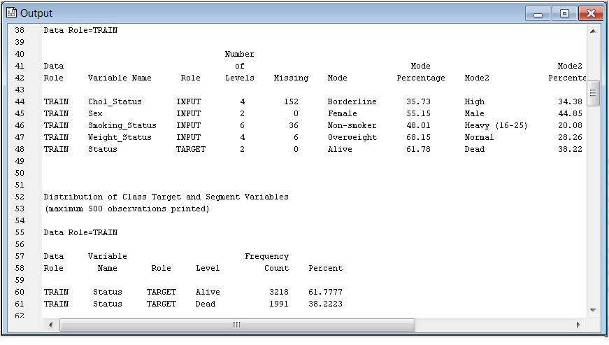
This analysis produces A LOT of statistics. This, I found interesting because despite some people arguing Enterprise Miner allows analysis by someone without extensive programming or statistics background, certainly in the case of statistics, the more knowledge you have, the better you could make use of the results.
For example, in the top right (all three of the screen shots above are one screen, I broke them up at an attempt at legibility), the output pane gives descriptive statistics broken down by each level of the target variable. I can see how many people who died had missing data for age at CHD diagnosis, skewness and kurtosis values for variables by status, living or dead, the mode for weight status for people who were living or dead, and a whole lot more. Interestingly, 68% of the whole sample was overweight.
Scrolling through the statistics output I can get a good idea of the data quality – is it skewed, is it missing, is it missing at random.
Without some background in statistics, that’s probably no more than a bunch of numbers. Personally, I found it very helpful. That’s another assignment for the students, to write a brief summary of their data, including any concerns. There weren’t any real problems with these data except for the obvious fact that variables like cholesterol and cholesterol status,smoking and smoking status are going to be highly correlated. It would be a good idea to include one of those as input in any predictive analyses and reject the other to prevent multicollinearity problems.
(NOTE to self: Make sure to explain variable roles, changing variable roles in EM and multi-collinearity.)
You might think this is adequate for running just one node, but, in fact, there is much more here than meets the eye. More on that tomorrow because speaking of overweight, I have been at a computer for 13 hours today and I want to hope on the bike and get some exercise in before I knock out the last task I need to do today. Although @sammikes just pointed out on twitter that round is a shape, it is not the one I want to be in.
Dealt with it :p
(http://preptags.com/misc/albino_goat.jpg if the picture doesn’t show)
Ha ha ha – awesome!