Some perks of the Gutenberg editor
Around our office, there are a lot of haters of the Gutenberg editor. However, I’ve found quite a few new features that are hard not to like. Here are just a few of them.
The cover block type
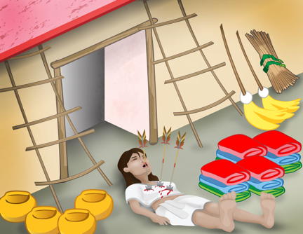
Say you’d like to have a background image for your text, like the one below. Just use the COVER block. Well, when I do that and put in the text and hyperlink it, the text is blue which is a hard color to read against that background color. So, I select the text and in the Color Settings in the right block settings, I pick white. Voila! Click the box below and check out AzTech: The Story Begins.
If you change your mind and transform the cover block back to a regular old image, then the text overlaid becomes the caption for the image, but where’s the fun in that?
You can change all kinds of attributes of the background images, for example, the opacity here was set to 60% and for the next image below to 40%.
The button block type
The button block does exactly what you might guess, it creates a button, with an optional link. You can easily change the background and text color just by selecting from the right panel under block settings (as in panel on your right, not as in correct panel, well, actually, that, too. I think this would be even more useful if you could combine it with the cover block, but, as of now, alas, that is not an option.
Sadly, buttons are not allowed here )-:
The columns block type
It’s funny given how much people made fun of me for using tables in my websites way back when we were making them with GoLive, that now we are back to something approximating tables. Also, you can see from the example below that you can get some pretty slick designs just with the Gutenberg editor out of the box. In the past, you’d need to do backflips with additional CSS to get the layout exactly how you wanted it.
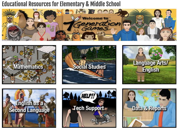
With the columns block, you can specify the number of columns, and you can even split some of the columns. If I wanted, I could split my English as a Second Language block above into two, Spanish and Lakota.
Of course, the nice thing about columns is that they, hopefully, are more responsive than tables. I say hopefully because the theme I am working with turns this into a very nice layout with all the blocks underneath each other for phones, but for smaller iPads it shows two sets of two boxes and then the last two underneath each other with a bunch of white space on the side. Oh well, nothing is perfect – yet.
Change is hard, but the new editor promises to be worth it
There are quite a few other new types in Gutenberg that I haven’t needed to use yet, but I am sure I will in the future, and some older features that seem to be significantly improved. If, like most of us in the office, found yourself swearing at WordPress because you’re existing site was working just fine and now you have to learn all this new $#@! when you really don’t have time, you might want to re-think that position.