What Good is Cook’s D ?
I’ve written here before about visual literacy and Cook’s D is just my latest example.
Most people intuitively understand that any sample can have outliers, say, an 80-year-old man who is the father of a six-year-old child, the new college graduate who is making $150,000 a year. We understand that those people may throw off our predictions and perhaps we want to exclude those outliers from our models.
What if you have multiple variables, though? It’s possible that each individual value may not be very extreme but the combination is. Take this data set below that I totally made up, with mom’s age, dad’s age and child’s age.
Mom Dad Child
30 32 6
20 27 5
31 33 8
29 28 6
40 42 20
44 44 21
37 39 14
25 29 7
30 32 6
20 27 5
31 33 8
29 28 6
39 42 19
43 44 20
37 39 13
25 28 6
40 29 15
Look at our last record. The mother has an age of 40, the father an age of 29 and the child an age of 15. None of these individually are extreme scores. These aren’t even the minimum or maximum for any of the variables. There are mothers older (and younger) than 40, fathers younger (and older) than 29; 15 isn’t that extreme an age in our sample of children. The COMBINATION, however, of a 40-year-old mother, 29-year-old father and 15-year-old child is an extreme case.
Enter Cook’s distance, a.k.a. Cook’s D, which measures the effect of deleting an observation. The larger the distance, the more influential that point is on the results. Take a look at my graph below.
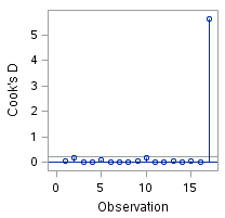 It is pretty clear that the last observation is very influential. Now, you might have guessed that if you had thought to look at the data. However, if you had 11 variables and 100 observations it wouldn’t be so easy to see by looking at the data and you might be really happy you had Cook around to help you out.
Let’s look at the data re-analyzed without that last observation. Here is what our plot of Cook’s D looks like now.
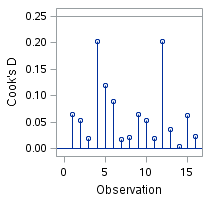 This gives you a very different picture. While a couple of points are higher than the others, it is certainly not the extreme case we saw before.
In fact, dropping out that one point changed our explained variance from 89% to 93%.
So … knowing how to use Cook’s D for regression diagnostics is our latest lesson in visual literacy.
You’re welcome.