Plots of Relative Risk: A picture says 1,000 words
I can’t believe I haven’t written about this before – I’m going to tell you an easy (yes, easy) way to find and communicate to a non-technical audience standardized mortality rates and relative risk by strata.
It all starts with PROC STDRATE . No, I take that back. It starts with this post I wrote on age-adjusted mortality rates which many cohorts of students have found to be – and this is a technical term here – “really hard”.

Here is the idea in a nutshell – you want to compare two populations, in my case, smokers and non-smokers, and see if one of them experiences an “event”, in my case, death from cancer, at a higher rate than the other. However, there is a problem. Your populations are not the same in age and – news flash from Captain Obvious here – old people are more likely to die of just about anything, including cancer, than are younger people. I say “just about anything” because I am pretty sure that there are more skydiving deaths and extreme sports-related deaths among younger people.

So, you compute the risk stratified by age. I happened to have this exact situation here, and if you want to follow along at home, tomorrow I will post how to create the data using the sashelp library’s heart data set.
The code is a piece of cake

PROC STDRATE DATA=std4

REFDATA=std4

METHOD=indirect(af)

STAT=RISK

PLOTS(STRATUM=HORIZONTAL);

POPULATION EVENT=event_e TOTAL=count_e;

REFERENCE EVENT=event_ne TOTAL=count_ne;

STRATA agegroup / STATS;
The first statement gives the data set name that holds your exposed sample data, e.g., the smokers, your reference data set of non-exposed records, in this example, the non-smokers. You don’t need these data to be in two different data sets, and, this example, they happen to be in the same one. The method used for standardization is indirect. If you’re interested in the different types of standardization, check out this 2013 SAS Global Forum paper by Yang Yuan.
STAT = RISK will actually produce many statistics, including both crude risk estimates and estimates by strata for the exposed and non-exposed groups, as well as standardized mortality rate – just, a bunch of stuff. Run it yourself and see. The PLOTS option is what is of interest to me right now. I want plots of the risk by stratum.
The POPULATION statement gives the variable that holds the value for the number of people in the exposed group who had the event, in this case, death by cancer, and the count is the total in the exposed group.
The REFERENCE statement names the variable that holds the value of the number in the non-exposed group who had the event, and the total count in the non-exposed group (both those who died and those who didn’t).
The STRATA statement gives the variable by which to stratify. If you don’t need your data set stratified because there are no confounding variables – lucky you – then just leave this statement out.
Below is the graph
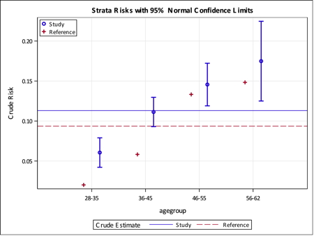
The PLOTS statement produces plots of the crude estimate of the risk by strata, with the reference group risk as a single line. If you look at the graph above you can see several useful measures. First, the blue circles are the risk estimate for the exposed group at each age group and the vertical blue bars represent the 95% confidence limits for that risk. The red crosses are the risk for the reference group at each age group. The horizontal, solid blue line is the crude estimate for the study group, i.e., smokers, and the dashed, red line is the crude estimate of risk for the reference group, in this case, the non-smokers.
Several observations can be made at a glance.
- The crude risk for non-smokers is lower than for smokers.
- As expected, the younger age groups are below the overall risk of mortality from cancer.
- At every age group, the risk is lower for the non-exposed group.
- The differences between exposed and non-exposed are significantly different for the two younger age groups only, for the other two groups, the non-smokers, although having a lower risk, do fall within the 95% confidence limits for the exposed group.
There are also a lot more statistics produced in tables but I have to get back to work so maybe more about that later.
I live in opposite world
Speaking of work — my day job is that I make games for 7 Generation Games and for fun I write a blog on statistics and teach courses in things like epidemiology. Actually, though, I really like making adventure games that teach math and since you are reading this, I assume you like math or at least find it useful.

Share the love! Get your child, grandchild, niece or nephew a game from 7 Generation Games.
One of my favorite emails was from the woman who said that after playing the games several times while visiting her house, her grandson asked her suspiciously,
Grandma, are these games on your computer a really sneaky way to teach me math?
You can check out the games here and if you have no children to visit you or to send one as a gift, you can give one to a school – good karma. (But, hey, what’s with the lack of children in your life? What’s going on?)
Interesting that the CIs for two of your groups do not exclude the reference point. Was it properly powered for those comparisons?