SAS Global Forum : A new kind of path analysis
First off, the good news. You can find all of the papers from SAS Global Forum 2015 online. This is good news if you are anything like me (and you should be, because, let’s face it, I’m awesome) because even if you went to Dallas there were no doubt several papers you wanted to attend scheduled at the same time.
I liked everything I attended but there were two that stood out as really interesting. The first one was …
Taking the Path More Travelled – SAS Visual Analytics and Path Analysis
Falko Schulz
You can download it here
http://support.sas.com/resources/papers/proceedings15/SAS1444-2015.pdf
My idea of path analysis is a series of regression coefficients where you calculate direct and indirect effects. That is not the path analysis discussed in this paper.
He literally means what path did the customer (critter, whatever) take ?
For example, your path in using this website could be you went to the home page then blog page home then the previous entry on the blog.
While websites are an obvious use for this type of path analysis, there could be many others – customer experience in a call center, where people go in a huge department store, migration of humans or animals, path to achieving a job at a start-up.
Drop-off is often of interest in a path analysis – did they fall out of the path before the endpoint you wanted, e.g., sale, employment, customer support problem solved?
You can also look at weight in a path, not only whether they buy a widget but how much money did they spend?
Visual analytics allows for path segmentation. You can combine items or exclude items.
In the example, Schulz discussed using path analysis to see how effective your different online marketing methods are. Since many people will come from typing your name into a search engine, you may want to delete those paths and only include ads from Google adwords, blogher, your corporate website and other paid marketing efforts.
You can click on events and select Exclude to filter out all paths beginning with those events that are not of interest to you.
Sankey diagrams are available in visual analytics. Although these have their origin in uses like energy flow, they are now being applied all over the place.
Here is a sample from Schulz’s paper
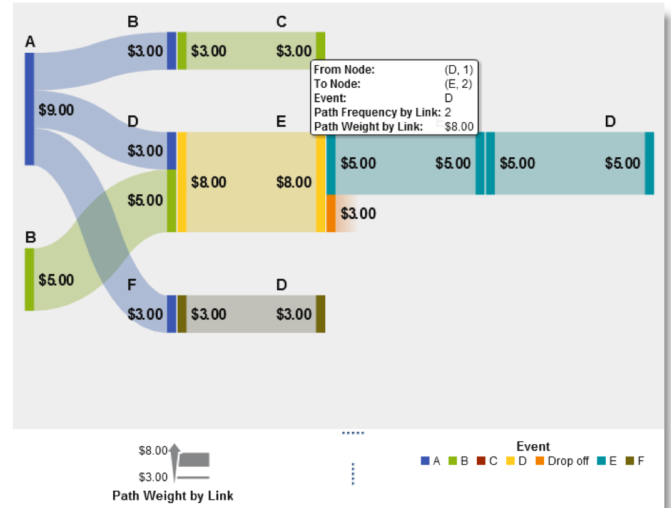
A Sankey diagram, FYI, shows the direction and quantity of the flow along a path. There is a blog devoted to Sankey diagrams here.
http://www.sankey-diagrams.com/sankey-definitions/
(This wasn’t mentioned in the paper, I just found that interesting. I’m sure there’s a blog out there devoted to Gantt charts that I could find if I looked, which I didn’t.)
Once the path analysis roles of interest are defined:
- Event
- Sequence
- ID
… one of the first things to do would be drop the number of paths displayed. Just imagine the mess you would be looking at if you tried to visually display all of the paths someone took in navigating a website with even a few hundred pages.
You can edit the minimum path frequency, e.g., only show a path if at least 250 people took it.
This is just a brief, brief taste of what you can do with path analysis using SAS Visual Analytics and the coolness of SAS Global Forum. There was a lot, lot more and I’ll try to post about the second paper I really liked this week,

but for now perhaps I should quit looking out the window and pay attention in this training session I’m sitting in at Fort Berthold (don’t tell Bruce I wrote my blog during it).
If you missed out on SAS Global Forum, you don’t need to wait until next year for your fix of networking, instruction (and possibly drinking). You can go to the Western Users of SAS Software conference in San Diego in September.