SPSS – Four Cool Things
If you haven’t checked out the site 43thing.coms website, you really should. You can post up to 43 things that you want to do and then add updates as you make progress on your things. As no good idea should ever go uncopied, I decided to write a couple of posts on cool things about statistical software. Because I am a lazy slacker, I decided to start with four instead of 43.
1. The Data Restructure Wizard – Let’s say you have entered your data totally the wrong way for the analysis you want to do. For example, you have measured the IQ of children at three different points, before a special preschool program, after a year in the program and after three years in the program. You want to see if the program had any effect. As a reasonable person, you have entered each child’s information on one row — ID number, age when entered the program, gender, and then first test score, second test score and third test score. SPSS, however, wants your data to be entered with a separate record for each test.
You could either re-enter all 100 subjects with three rows per subject instead of one. OR, you could pick the Data Restructure Wizard
2. SPSS thinks about statistics even more than I do. For example, a question that is often in people’s minds when they use SPSS and see what look like two pretty similar charts under bar charts and histograms is, “What the heck is the difference between the two of these?”
The link , on the Visuale blog, gives a really good, simple explanation of a difference most of us understand after a semester of statistics, but never really articulate. In short, a bar chart shows counts for each category of nominal variables while a histogram is the graph of the density function of a continuous variables. Because SPSS does make the distinction that most of us know but don’t think about, it will not let you use a numeric variable for the X axis on a bar chart. You need to select histogram for that. Now you know.
 3. Speaking of the new Chart Builder – I like it. I have to confess that it took me some time to get used to this. Software developers and software users have two different mindsets. Most people developing software, when they come up with the idea of a new and improved feature think to themselves,
“Wow! The users are really going to love this! This is way better.”
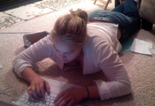
The image they have of the user response is like the person at left, raptly learning the wonderful features of the new software.
The actual response of users is more like ,
“#@!% I have to learn something else. I am too busy for this.”
There are two reasons to get up to speed now on the new chart features. First, they are better. Second, the legacy code in almost everything eventually goes away. You don’t want to be like that person still using Windows 95. Spend some time learning how to make pretty pictures.
4. OLAP cubes, which after I initially thought they were stupid have decided are way cool. Here is how an OLAP cube works in SPSS. You first get a table that looks like it did not work, just the total of all the responses for the variables you requested. You look at it for a minute and conclude,
“That’s stupid, it didn’t work.”
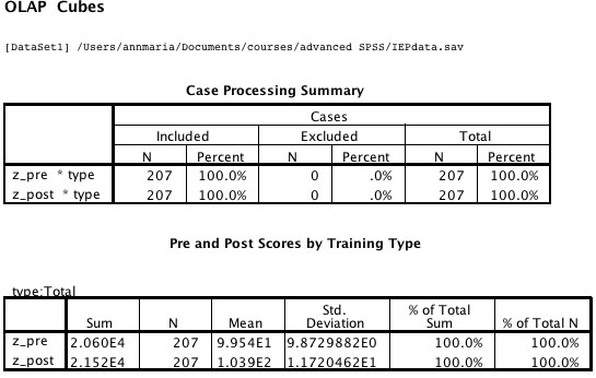
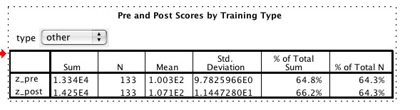
What you actually have is dynamic output. Double-click on the table and a drop-down menu will appear. As a default it shows the total but you can pull down on it and select any individual category. For example, below, I can see that while the difference between pre- and post-test in the total was 4.4 points (103.9 – 99.5) for the 133 people in the “other” category, the difference was 6.8 points (107.1 – 100.3). And yes, I do hate that E-thing, too, and yes I do know it is called scientific notation which makes it not one whit less annoying.
You may want to edit your other blog to link to this one instead of “Good bye and Thanks for All the Fish”
Thank you for describing how OLAP cubes work. I too thought, “Well, that’s rubbish and not at all what I wanted.” SPSS help was not helpful either. Thank you for your blog and its simple. “double click on the table” instructions!
That is a very helpful description of
OLAP cube. I too intitially thought that
its not working/what is the value addition
in OLAP?
Thank you so much.
Hey! I am grateful for reading such informative content. Yes, these are really cool things about SPSS. Thank you for your helpful description of how OLAP cubes work. This blog post couldn’t be written better. Thank you for taking the time to provide us with your information. Keep posting regularly.
Thanks for sharing content like this, it’s very helpful in learning SPSS. And the way you define the cool things about SPSS and some functionality is good. We also provide SPSS consulting services if you need any kind of assistance related to SPSS Data analysis you can contact us by visiting our website.
Site: https://silverlakeconsult.com/
Really enjoyed this, especially your explanation of histograms vs bar charts and the OLAP cube example. These are exactly the kinds of things that confuse early-stage researchers. Once the analysis side is clear, the next big hurdle is proper documentation, approvals, and reporting. For anyone moving from SPSS practice to real studies:
Start your clinical research the right way with expert medical research support.
For More Information Visit: https://planetmed.pro/