Visual Analytics are EVERYWHERE: SAS Global Forum Continued
The nice thing about going to SAS Global Forum is that it’s the gift that keeps on giving. Long after I have gone home, there are still points to ponder.
Visual analytics is big and not just in the sense of there is a product out called that which I have never used but that every presentation, no matter how ‘tech-y’ now makes very effective use of graphics. If I was the type of person to say I told you so, I would mention that I predicted this six years ago after I went to SAS Global Forum in 2010.
In my last post, I mentioned the propensity score graphic with mustaches.
Richard Culter’s presentation on PROC HPSPLIT, which was really excellent, made extensive use of graphics to illustrate fairly complex models.
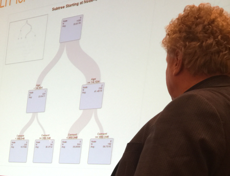
You can create classification and regression trees (the model you can’t see in this tiny graphic on the left) and you can drill down into sub-trees for further analysis.
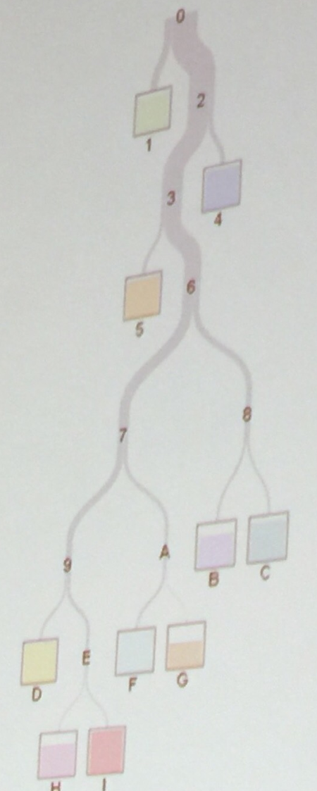
Sometimes your classification tree is very easily interpretable. For example, in this case here from the same presentation, each split represents a different type of vegetation/ land surface – water, two different species of tree, etc.
Speaking of classification, regression and PROC HPSPLIT ….
If you didn’t know, now you know
PROC HPSPLIT is a high performance procedure for fitting and classification now available in SAS/STAT which is useful for data sets where relationships are non-linear. It produces classification and regression trees, includes options for pruning trees and a whole lot more. It is now available on a single computer, not limited to high performance computing clusters. So, yay!
A regression tree is what you get when your dependent variable is continuous, and a classification tree when it is categorical, as in the vegetation example above.
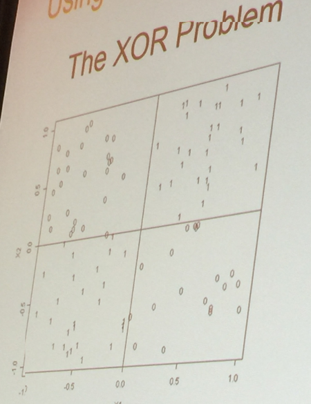
On a semi-related note, graphics can even be used to show when a data set is not suited to a linear model as in the example below, also from Cutler’s presentation. You can see that all of the 1’s are in two quadrants and all of the 0’s in two other quadrants. Yes, you COULD use a regression line to fit this but that is not the best fit of the data.
Also, on a related topic that visualizing data, like all of statistics, really, is a process of iterations, I think this would be more obvious if the quadrants were color coded.
‘
I have a lot more to say on this but I am in North Dakota speaking at the ND STEM conference this weekend and a kind soul gave me tickets to the hockey game in the president’s box, so, peace, I’m out.

One Comment