Descriptives, Details and Death
I think descriptive statistics are under-rated. One reason I like Leon Gordis’ Epidemiology book is that he agrees with me. He says that sometimes statistics pass the “inter-ocular test”. That is, they hit you right between the eyes.
![]()
I’m a big fan of eye-balling statistics and SAS/GRAPH is good for that. Let’s take this example. It is fairly well established that women have a longer life span than men in the United States. In other words, men die at a younger age. Is that true of all causes?
To answer that question, I used a subset of the Framingham Heart Study and looked at two major causes of death, coronary heart disease and cancer. The first thing I did was round the age at death into five year intervals to smooth out some of the fluctuations from year to year.
data test2 ;
set sashelp.heart ;
ageatdeath5 = round(ageatdeath,5) ;
proc freq data=test2 noprint;
tables sex*ageatdeath5*deathcause / missing out= test3 ;
/* NOTE THAT THE MISSING OPTION IS IMPORTANT */
THE DEVIL IS IN THE DETAILS
Then I did a frequency distribution by sex, age at death and cause of death. Notice that I used the missing option. That is super-important. Without it, instead of getting what percentage of the entire population died of a specific cause at a certain age, I would get a percentage of those who died. However, as with many studies of survival, life expectancy, etc. a substantial proportion of the people were still alive at the time data were being collected. So, percentage of the population, and percentage of people who died were quite different numbers. I used the NOPRINT option on the PROC FREQ statement simply because I had no need to print out a long, convoluted frequency table I wasn’t going to use.
I used the OUT = option to output the frequency distribution to a dataset that I could use for graphing.
More details: The symbol statements just make the graphs easier to read by putting an asterisk at each data point and by joining the points together. I have very bad eyesight so anything I can do to make graphics more readable, I try to do.
symbol1 value = star ;
symbol1 interpol = join ;
Here I am just sorting the data set by cause of death and only keeping those with Cancer or Coronary Heart Disease.
proc sort data=test3;
by deathcause ;
where deathcause in (“Cancer”,”Coronary Heart Disease”);
Even more details. You always want to have the axes the same on your charts or you can’t really compare them. That is what the UNIFORM option in the PROC GPLOT statement does. The PLOT statement requests a plot of percent who died at each age by sex. The LABEL statement just gives reasonable labels to my variables.
proc gplot data = test3 uniform;
plot percent*ageatdeath5 = sex ;
by deathcause ;
Label percent = “%”
ageatdeath5 = “Age at Death” ;
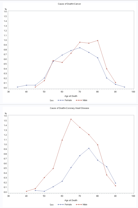
When you look at these graphs, even if your eyes are as bad as mine you can see a few things. The top chart is of cancer and you can conclude a couple of things right away.
- There is not nearly the discrepancy in the death rates of men and women for cancer as there is for heart disease.
- Men are much more likely to die of heart disease than women at every age up until 80 years old. After that, I suspect that the percentage of men dying off has declined relative to women because a very large proportion of the men are already dead.
So, the answer to my question is “No.”