A statistical picture is worth 1,000 words
One nice thing that SAS Enterprise Guide does is produce a series of graphs when you do a logistic regression. Too many people just skim over the table of Type III effects, say what is significant and isn’t and go on their merry way, which is too bad, because sometimes your graphs are very easy to use to explain your results, even to someone with little technical knowledge.
Take these two examples I came across recently using a sample I was analyzing. I’m interested in predicting who died within a nine-year period, and I have a set of possible predictors including Age at Baseline (the beginning of the nine-year period), gender, race, whether they lived in a nursing home and whether the person drank alcohol.
Look at my first graph, with predicted probability of death at each age from early sixties to late nineties. The lines show the probability of death at each age, holding constant gender and the number of emergency room visits (a measure of health). There are ten curves for the ten combinations of five racial groups by alcohol use (yes or no). For our youngest subjects, the probability of death ranges from a low of around 15% for the lowest group to 24% for the highest. 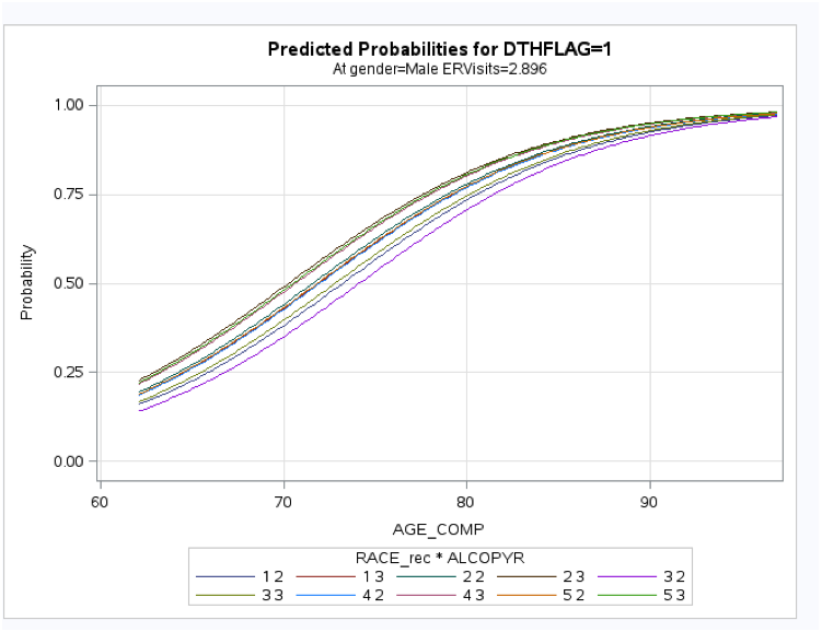
[Click on image to expand]
Now let’s look at our second graph, which is, for the same sample, across the same age range, predicted probability, again holding constant the number of emergency room visits but with separate plots by gender and nursing home status. Here there is a very clear difference, with the probability of death for males in a nursing home over 50% even at the youngest age. Females in a nursing home have a predicted probability of death around 27% at the same age. For females of the same age who are not in a nursing home, the probability of death is less than half that.
I like odds ratios as much as the next statistician, but the fact is, the comparison of these two charts is a lot simpler for the average person. Race and whether or not you drink alcohol don’t seem to make much difference in this model. In the second model, gender and nursing home status both have a sizable difference.
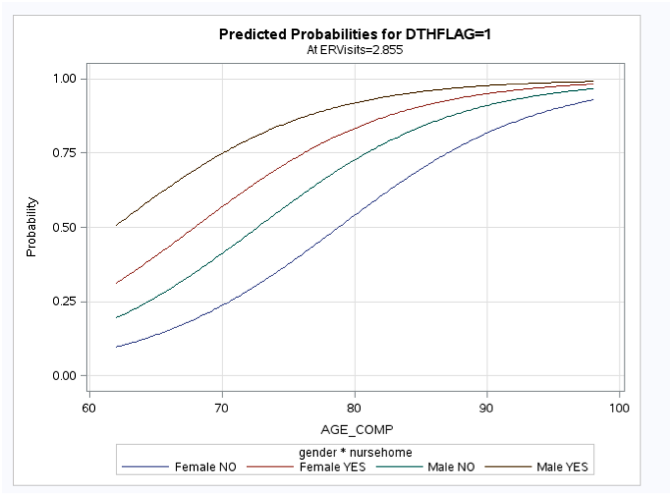
[Click on image to expand]
Your graphs don’t always come out so nicely, but when they do, I recommend you use them instead of trying to explain Type III effects to people who have no idea what you are talking about.
2 Comments