Logistic regression, in pictures : Part 2
I tweeted that I believed one could explain logistic regression results in three or four charts, and Alberta Soranzo tweeted back,
“Try me.”
Challenge accepted.
These data are taken from the Kaiser-Permanente study of the Oldest Old, a sample of 5,986 people who were aged 65-95 when recruited into the study. Participants were followed for nine years, or until they died, at which time it was pointless to continue following them as they weren’t going anywhere.
Last post I showed the predicted probabilities charts for two different models. I pointed out that it was quite clear the first model was superior. Using the same sample of older adults, nursing home status and gender were much better at predicting who died than were race and alcohol consumption in the past year (coded only as if a person drank alcohol or not).
Nursing home status and gender are better than those other variables, but are they actually any good? Are they statistically significant? Is the effect substantial?
Next chart to examine is the odds ratios with 95% confidence limits.
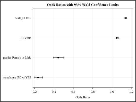
If the odds of living vs dying are equal for people in a nursing home and not in a nursing home, then the odds ratio will be 1.0. If the odds of people dying are LESS for people who are not in a nursing home (NO vs YES) then the odds ratio will be less than 1. As you can see, the odds of people not in nursing homes dying are considerably less than those who are in nursing homes. Females have lower odds of dying than males. Being in a nursing home (or not) is a better predictor of dying within the next nine years than is gender.
The dots on the chart are the odds ratio for each variable and the bars extend across the 95% confidence interval. If the bars cross 1.0 then the odds being equal is a value that falls within the 95% confidence limits – or, in other words, the predictor is not statistically significant.
You can also see from this chart that all four of our predictors are significant. You can also see that people who are older and have more visits to the emergency room are more likely to die.
I saw your tweet and smiled thinking yes… 🙂
I think the odds ratio with 95% confidence interval plot is fantastic! A nice and easy way to interpret tabular results.
My thoughts exactly!
You win. Even I got it.
However, the most significant bit of information that I derived from this post and the previous is that, eventually, we’re all going to die 🙂
Seriously? You NEVER see such tight confidence intervals in real life. Not that Kaiser isn’t real life. My Dad worked for Kaiser Permanente for +20 years, so truly, I should be more sanguine.
Both SAS and R allow you do make these graphs.
David – Yep, that’s the actual data and the real results. There are almost 6,000 subjects in this study.
Alberta – Actually, thanks to you, I think I’m going to start that part of my talk in San Diego in two weeks with Logistic Regression in Pictures