Super-Easy Outlier Check with Proc Freq
Sometimes, you can just eyeball it.
Really, if something truly is an outlier, you ought to be able to spot it. Take this plot, for example.
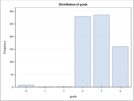
It should be pretty obvious that the vast majority of our sample for the Fish Lake game were students in grades, 4, 5 and 6. Those in the lower grades are clearly exceptions. I don’t know who put 0 as their grade, because I doubt any of our users had no education.
I use these plots especially if I’m explaining why I think certain records should be deleted from a sample. For many people, it seems as if the visual representation makes it clearer that “some of these things don’t belong here.”
Did you know that you can get a plot from PROC FREQ just by adding an option, like so:
PROC FREQ DATA= datasetname ;
TABLES variable / PLOTS=FREQPLOT ;
This will produce the frequency plot seen above, as well as a table for your frequency distribution.
Well, if you didn’t know, now you know.