A picture of a pretest: Statistical graphics
A picture says 1,000 words – especially if you are talking to a non-technical audience. Take the example below.
We wanted to know whether the students who played our game Fish Lake at least through the first math problem and the students who gave up at the first sight of math differed in achievement. Maybe the kids who played the games were the higher achieving students and that would explain why they did better on the post-test.
You can see from the chart below this is not the case. The distribution of pretest scores is pretty similar for the kids who quit playing (the top) and those who persisted.
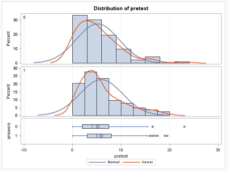 Beneath the graphs, you can see the box and whisker plots. The persistent group has fewer students at the very low end and we actually know why that is – students with special needs in the fourth- and fifth-grade, for example, those who were non-readers, could not really play the game and either quit on their own very soon or were given alternative assignments by the teacher.
The median (the line inside the box), the mean (the diamond) and 25th percentile (the bottom of the box) are all slightly higher for the persisting group – for the same reason, the students with the lowest scores quit right away.
These data tell us that the group that continued playing and the group that quit were pretty similar except for not having the very lowest achieving students.
So, if academic achievement wasn’t a big factor in determining which students continued playing the games, what was?
That’s another chart for another day, but first, try to guess what it was.
———–
Would you like to play one of our games? Check them out here – all games run on Mac and Windows.

What about Chromebooks? Check out Forgotten Trail.