Graphs with SAS Enterprise Guide: Stuff I always forget
I haven’t been using Enterprise Guide much lately but tonight I could not get the SAS Web Editor to work and I had some graphs I needed to get done. It was convenient to do this with SAS Enterprise Guide because I wanted to do bar charts of the mean of one variable broken down by three other variables. There are a few things, though, that I always forget how to do with SAS Enterprise Guide graphs and I always have to look them up again, so I’m writing it all in one place for the next time I need to remember how to do this.
For example,let’s say I gave children one of two brands of juice. They received the juice either 25%, 50% or 75% of the school days and the other days I gave them either distilled or fluoridated water. At the end of some time, I wanted to measure the amount of Fluoride in the children’s system. (Don’t worry if this is possible or not, it’s just an example). SAS is handy for this because you can create a summary table using the SUMMARY TABLES task and then under results click to save the results to a data set. Now I have my data nicely set up to graph.
I want it to have one bar for each unique data value. I don’t want it to scale the X axis to fit the data and show bars at 30%, 60% or whatever. I want it show the EXACT value of 25%. (Note: If these images are too small to see you should be able to double-click to bring up the original image size.)
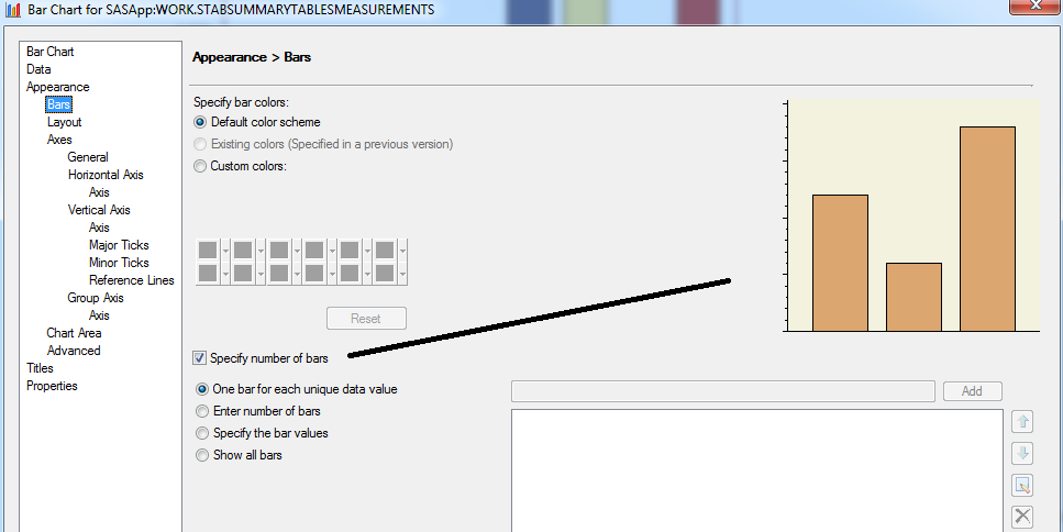
The first part is easy. Under the APPEARANCE tab in the left window pane, click BAR. Then, in the window that appears near the bottom, click on SPECIFY NUMBER OF BARS and click next to the first button ONE BAR FOR EACH UNIQUE VALUE.
Also, I have two different groups and I very, very much want the bar charts to have the same vertical axes to make it easy to compare them side by side.
SAS does NOT do this by default. Instead, it scales to fit your data. I don’t want that. I want both charts to have the same maximum and minimum.
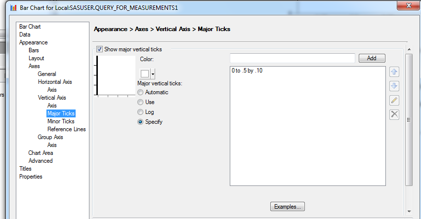
The next step is to make sure the Y axes of each chart are the same. Under VERTICAL AXES click MAJOR TICKS. In the window that appears, click the button next to the last option, SPECIFY. On the right side of the window you can now give individual tick marks for the Y axis or you can give a scale, such as 0 TO .5 BY .05 .
Note: I did this with SAS Enterprise Guide 4.2 and it worked fine. I did it with SAS On-Demand for SAS Enterprise Guide 4.3 and it did NOT work. Not at all. Not even when I copied and pasted the code into the program editor and ran it. It just did not re-size the axes. I have a very old version of SAS Enterprise Guide/ SAS On-Demand. In fact, the only reason I was using it at all was because the SAS Web Editor wasn’t working. So, hopefully that is something fixed with the new release coming out in June.
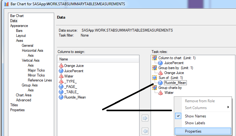
Minor thing – I want to change the label on all of these to make my chart look better. Since it already says in the title it is the mean Fluoride level, I want to change the variable name from what the TABULATE procedure named it Fluoride_mean to just Fluoride. To give a variable a different label on the chart, right-click on the variable name once it has been dragged into the task role on the right window pane. Select PROPERTIES. A window will pop up that allows you to change the properties (duh). Type in whatever label you want.
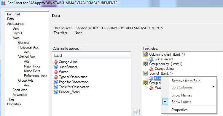
After you have given it a label and closed the properties window, right-click on your variable again. This time select SHOW LABELS.
So, now I have my nicely labeled chart with the same Y axis for both graphs and a unique bar that matches exactly each of my categories.
Just another random thing I always forget. I happened to be doing this running Windows 7 using boot camp on a Mac. If you want to take a screen shot using a Mac some help pages tell you to use the F14 key. Just one problem – my keyboard only goes up to F12. Fn-shift-F11 will do a screen print when you are using boot camp.
AnnMaria, sometimes the behavior can be slightly different due to the graph device type that you specify. Try changing your Graph device options to PNG (from the default of ActiveX) and see if that helps.
You can do this in Tools->Options->Results->Graph OR at the task level (right-click on the task node in the process flow, Properties, Results tab).
Oh, and screen shot tip for Windows 7: go to Start, Search field and type “Snipping” — the Snipping Tool comes up. Then you can capture shots at the screen level, window level, or draw-your-own-box level.
Thanks for the tip, Chris. I did notice on some browsers the graphs did not show when I used ActiveX but showed up fine using png
Hey there, bless you for the posting. I really enjoy the content I’m getting.