When Data is Not Art
I failed art in junior high school. When I tell people that, people who actually have artistic talent, they look at me in disbelief and say,
“No one fails art. That’s one of the great things about art. How could you possibly fail art?”
The answer is that I was very, very bad at it. Part of this might have to do with the fact that I am extremely near-sighted and was constantly losing my glasses and then going without for weeks or months until somehow my mom found the money to buy me yet another pair. The other part, to be truthful, is that I was just very, very bad at it.
Narratives 2.0 has awesome pictures of music tracks, which maybe mean something if you are a musician. Then again, maybe not.
Flowing data is more what I am talking about in terms of data visualization. While some of the graphics are just plain funny (the one on love, for example) , the message of this map, on mortality rate under five, should be obvious to almost anyone.
Often, when I am looking at data, it is something far less artistic. I’ve done a lot of program evaluations over the years, sometimes of programs that were not exactly above board. After all, the staff members reason, I’m flying in from thousands of miles away. They’ll just enter some names and test scores in their database. How will I possibly know?
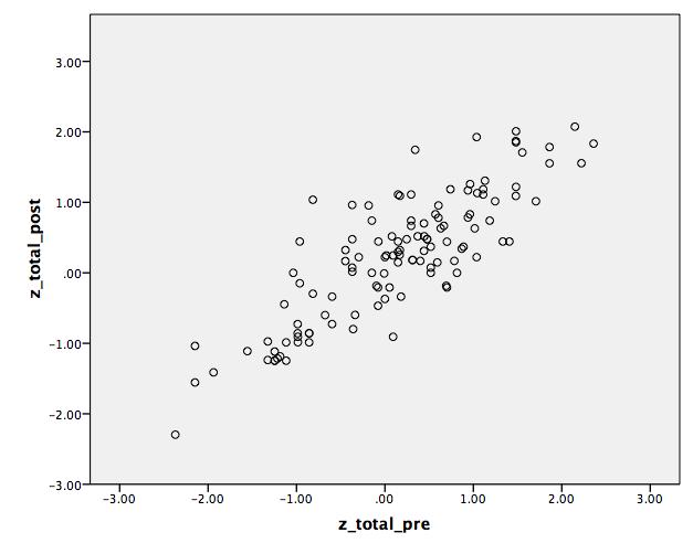
Here is an SPSS dataset that happened to be lying around. It has the actual data from a project that was supposed to be providing staff training. There was an experimental group, which received the training, and a control group that did not. The first thing I do is select out the control group and plot the pre-test by the post-test. If this is a reliable test, there should be a high correlation between pre- and post-test for the control group, fitting pretty close to a straight line.

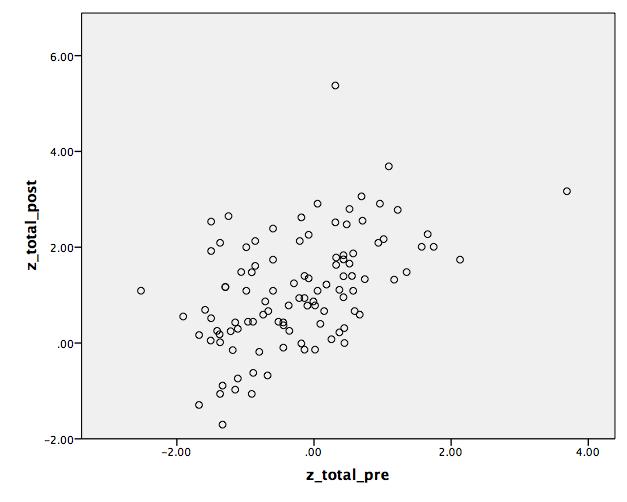
The next thing I do is SELECT CASES (found under the DATA menu) for the experimental group. If the training was effective at all, there should be a correlation between the pretest and post-test for the experimental group, but there should be more scatter around the line. Why? Because some people benefit more from training than others. Some come late, leave early and fall asleep in between. Others pay rapt attention and read more about the topic on-line when they get home. Some people with really high scores may have known all of the information in the training and not gained a point. Other people with average pre-test scores may have learned a lot and moved up to a higher score. People who had a very high pre-test score should still have a high post-test score. Hopefully, your training didn’t make them dumber. (Although I think I have attended a training session or two that felt like that.)
So, this is the pattern I am looking for – more scatter on the experimental group, tighter in the control group and those with high scores are more likely to stay high than low or moderate scores are to stay in the same place.

If this is NOT the pattern observed, then you and I are going to have a little chat and try to explore these data further. Personally, most of the time I have found more confusion than corruption. For example, once I was looking at graphs like those above but the relationship for the control group was not quite as strong as I expected and for the experimental group there was more of a relationship than I expected. I said,
“It looks as if possibly someone entered people as being in the experimental group who were actually in the control group and vice versa.”
A couple of the staff members looked guiltily at one another and then one spoke up,
“You know, I never really understood which was which.”
So… with only a minimal amount of sighing and eye-rolling, and a significant addition to our eventual bill, one of our young staff members checked all of the files, sorted them into the correct piles, corrected the database and we re-did the analyses.
A second situation in which, more than once, we have seen a different pattern than expected is when the amount of intervention varies greatly. I may see a clump of people who seem more like the control group. Their scores are pretty much the same as when they started. When you and I have our discussion about your program and I ask about those people it turns out that they were in the group that received therapy, after-school tutoring or whatever but they only came to one or two sessions and then dropped out. On the other hand, those people who actually did come to all 15 or 25 or 40 sessions showed significant improvement. When we find these patterns, we split the clients the project served into two groups – and it is usually easy to see a naturally occurring break – and analyze those who came to X number of sessions or more versus the control group. We also take a look at the people who dropped out of the program to see what information we can provide on the people who are not being reached.
We often expect that the more of a treatment an individual gets – therapy, training, tutoring – the better he or she will do. We don’t consider very often a second factor in there. The more of an intervention a person gets the more the therapist has given and, presumably, the better he or she gets at it. This is going to be especially true with a new program. Of course, if you have been tutoring for 20 years, an extra two years of experience isn’t going to make near as much difference as if you have six months of experience. Starting off my career as an industrial engineer back in the early 1980s (yes, they did have engineers back then), I was more familiar with learning curves than I wanted to be and it surprises me that we don’t think of these in social science very often.
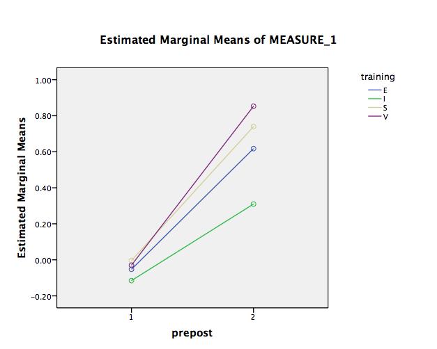
Let’s take a look at this with our same training data. We have training delivered for four groups over a two year period.

For simplicity, I have included only the experimental group above. The first group that was trained, the green line, shows the least improvement, the middle two groups, which were trained in the middle of the project showed more improvement and by far the most improvement was shown by the fourth group (the purple line), trained when the staff had nearly two years of experience on this project.
[For those who want to know, yes, I did do a repeated measures Analysis of Variance with time (pre-test/post-test) as the repeated factor and group (experimental versus control) and training cohort as the between subjects factor. Yes, I did test for a three-way interaction and yes it was statistically significant at p < .001 . Yes, there was also a significant interaction of time by group, with the experimental group improving significantly more than the control group, also at p < .001 . ]
Dear Sir,
I have the pleasure to brief on our Data Visualization software
“Trend Compass”.
TC is a new concept in viewing statistics and trends in an animated
way by displaying in one chart 5 axis (X, Y, Time, Bubble size &
Bubble color) instead of just the traditional X and Y axis. It could
be used in analysis, research, presentation etc. In the banking
sector, we have Deutsche Bank New York as our client.
Link on Chile’s Earthquake (27/02/2010):
http://www.epicsyst.com/test/v2/EarthQuakeinChile/
This a link on weather data :
http://www.epicsyst.com/test/v2/aims/
This is a bank link to compare Deposits, Withdrawals and numbers of
Customers for different branches over time ( all in 1 Chart) :
http://www.epicsyst.com/test/v2/bank-trx/
Misc Examples :
http://www.epicsyst.com/test/v2/airline/
http://www.epicsyst.com/test/v2/stockmarket1/
http://www.epicsyst.com/test/v2/tax/
http://www.epicsyst.com/test/v2/football/
http://www.epicsyst.com/test/v2/swinefludaily/
http://www.epicsyst.com/test/v2/flu/
http://www.epicsyst.com/test/v2/babyboomers/
http://www.epicsyst.com/test/v2/bank-trx/
http://www.epicsyst.com/test/v2/advertising/
This is a project we did with Princeton University on US unemployment :
http://www.epicsyst.com/main3.swf
A 3 minutes video presentation of above by Professor Alan Krueger
Bendheim Professor of Economics and Public Affairs at Princeton
University and currently Chief Economist at the US Treasury using
Trend Compass :
http://epicsyst.com/trendcompass/princeton.aspx?home=1
Latest financial links on the Central Bank of Egypt:
http://www.epicsyst.com/trendcompass/samples/Aggregate-balance-sheet/
http://www.epicsyst.com/trendcompass/samples/balance-sheet
http://www.epicsyst.com/trendcompass/samples/banks-deposits-by-maturity/
http://www.epicsyst.com/trendcompass/samples/egyptian-banks/
http://www.epicsyst.com/trendcompass/samples/currency-by-denomination/
I hope you could evaluate it and give me your comments. So many ideas
are there.
You can download a trial version. It has a feature to export
EXE,PPS,HTML and AVI files. The most impressive is the AVI since you
can record Audio/Video for the charts you create.
http://epicsyst.com/trendcompass/FreeVersion/TrendCompassv1.2_DotNet.zip
All the best.
Epic Systems
http://www.epicsyst.com