Logistic regression in pictures: Part 3
This is the third and last part of my attempt to explain logistic regression in pictures. You can see a picture of odds ratios here, and a picture of two charts of predicted probabilities, to compare models, here.
If people only know one chart associated with logistic regression, it is usually the ROC chart, though many of them cannot tell you what ROC stands for (not that it really matters) or how to interpret the chart – which kind of does matter, because it’s useful.
The ROC curve is an abbreviation for receiver operating characteristic curve (I told you it didn’t matter). This is a plot of
SENSITIVITY – the percentage of true positives, the people we predicted would die who did, and
SPECIFICITY – or true negatives, the number of people we said would NOT die, who did not
We actually plot (1 – specificity) by sensitivity. If we predicted no one would die, our rate of true negatives would be 100%. Since we predicted nobody would die, we would be exactly right for all of the people who didn’t die. 1 – 1.0 = 0 so we’d be at 0 on the X axis.
On the other hand, we’d have zero sensitivity. Since we predicted no one would die, we would have zero true positives.
At the other extreme, if we predicted everyone would die, we would have 100% true positives and 0 true negatives. Since 1-0 = 1 , that would be at the upper right corner here.
The straight line is what we would get without any predictor variables, if we just randomly guessed whether a person would live or die. The top left corner, where we have correctly predicted all of our positives and all of our negatives is what we would get in a perfect model.
The more that curve is bowed toward the top left and away from the straight line, the better our model.
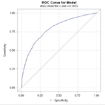
Let’s take a look at our actual curve from the Kaiser-Permanente data, where we used gender, age, number of emergency room visits and nursing home residence (yes or no) to predict whether or not a person would die within the next nine years.
From this, we can conclude that while our model is substantially better than random guessing – a conclusion that is consistent with what we saw in our previous charts. We can also see that there is definitely room for improvement. Perhaps future research could improve prediction by including behavioral risk indicators such as amount of alcohol and tobacco usage, as well as socioeconomic status and diagnosis of chronic illness.
So, there you have it – logistic regression in three blog posts and four pictures.