Know Thy Data: The Most Important Commandment in Statistics
I was going to write about prevalence and incidence, and how so-called simple statistics can be much more important than people think and are vastly under-rated. It was going to be cool. Trust me.
In the process, I ran across two things even more important or cooler (I know, hard to believe, right?)

Here’s what happened … I thought I would use the sashelp library that comes with SAS On-Demand for Academics -and just about every other flavor of SAS – for examples of difference in prevalence. Since no documentation of all the data sets showed up on the first two pages of Google, and one is prohibited by international law from looking any further, I decided to use SAS to see something about the data sets.
Herein was revealed cool thing #1 – I know about the tasks in SAS Studio but I never really do much with these. However, since I’m teaching epidemiology this spring, I thought it would be good to take a look. You should do this any time you have a data set. I don’t care if it is your own or if it was handed down to you by God on Mount Sinai.

Okay, I totally take that back. If your data was handed down to you by God on Mount Sinai, you can skip this step, but only then.
At this point, Buddhists and Muslims are saying, “What the fuck?” and Christians are saying, “She just said, ‘fuck’! Right after a Biblical reference to Moses, too!”
This is why this blog should have some adult supervision.
But I digress. Even more than usual.
KNOW YOUR DATA! I don’t mean in the Biblical sense, because I’m not sure how that is even possible, but in the statistical sense. This is the important thing. I don’t care how amazingly impressive the statistical analyses are that you do, if you don’t know your data intimately (there’s that Biblical thing again) you may as well make your decisions by randomly throwing darts at a dartboard. I once told some people at the National Institutes of Health that’s how I arrived at the p-value for a test. For the record, the Men in Black have more of a sense of humor about these things than the NIH.
Ahem, so … if you are using SAS Studio, here is a lovely annotated image of what you are going to do.
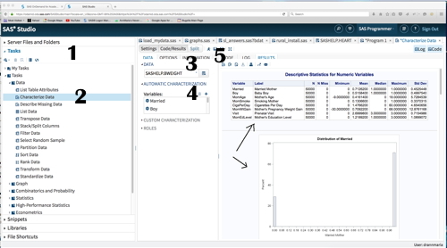
1. Click in the left window pane where it says TASKS on the arrow to bring up a drop down menu
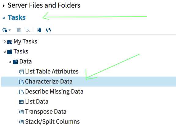
2. Click on the arrow next to Data and then select the Characterize Data task. (You might say that was 2 AND 3 if you were a smart ass and who asked you, anyway?)
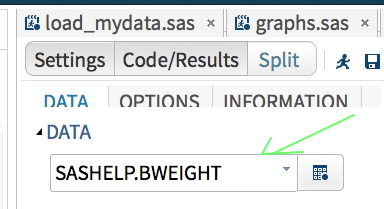
3. Click the arrow next to the word DATA in the window pane second from the left and it will give you a choice of the available directories. (NOTE: If you are going to use directories not provided by SAS you’ll need a LIBNAME statement in an earlier step but we’re not and you don’t in this particular example.) Under the directory, you will be able to select your file, in this case, I want to look at birthweight.
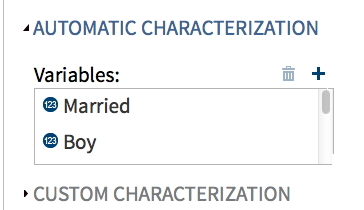
4. Next to the word VARIABLES, click the + and it will show the variables in the data set. You can hold down the shift key and select more than one. You should do this for all of the variables of interest. In my case, I selected all of the variables – there aren’t many in this dataset.
5. To run your program, click the little running guy at the top of the window. This will give you – ta- da
RESULTS!
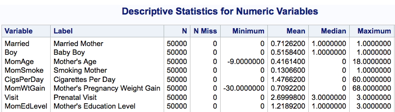
Let’s notice something here – the mother’s age ranges from -9 (seriously? What’s that all about?) to 18. Is this a study of teenage mothers or what? The answer seems to be “what” because the mean age is .416. Say, what? The mother’s educational level ranges from 0 to 3, which probably refers to something but I’ll bet it’s not years of education.
In a class of 50 students, inevitably, one or two will turn in a paper saying,
“The average mother had 1.22 years of education.”
WHAT? Are you even listening to yourself? Those students will defend themselves by saying that is what “SAS” told them.
According to the SAS documentation, these data are from the 1997 records of the National Center for Health Statistics.
I ran the following code:
proc print data=sashelp.bweight (obs=5) ;
And either it’s the same data set or there was an amazing coincidence that all of the data in the first five records was the same.
However, because I really need to get a hobby, I went and found the documentation for the Natality Data set from 1997 and it did not match up with the coding here. This led me to conclude that either:
a. SAS Institute re-coded these data for purposes of their own, probably instructional,
b. This is actually some other 1997 birthweight data set from NCHS, in which case, those people have far too much time on their hands.
c. SAS is probably using secretly coded messages in these data to communicate with aliens.

Not being willing to chance it, I went to the NCHS site and downloaded the 2014 birth statistics data set and codebook so I could make my own example data.
So … what have we learned today ?
- The TASKS in SAS Studio can be used to analyze your data with no programming required.
- It is crucial to understand how your data are coded before you go making stupid statements like the average mother is 3 months old.
- You can download birth statistics data and other cool staff from the National Center for Health Statistics site.
- The Spoiled One uses any phone not protected by National Security Council level of encryption for photos of herself.
———
Want to make your children as smart as you?
Get them 7 Generation Games. Learn math. Learn social studies. Learn not to fall into holes.
Runs on Mac and Windows for under ten bucks.
The birth weight data was an example for PROC QUANTREG long before it was added to the SASHELP library. You can find out more about the data in the SAS/STAT User’s Guide:
http://support.sas.com/documentation/cdl/en/statug/68162/HTML/default/viewer.htm#statug_qreg_examples03.htm
I was as confused as you the first time I saw the data, but the doc explains almost everything. In particular:
1) The data are a random subset of 50,0000 observations from the June 1997 Detailed Natality Data.
2) The mothers “were between the ages of 18 and 45” and the MomAge variable is “centered at the mean value,” which is 27.
3) Similarly, MomWtGain is centered at the mean value, which is 30.
4) There is a format that you can apply to the MomEdLevel variable: 0=HS, 1=SomeCollege, 2=College, 3=LessThanHS (??Who uses ‘3’ to mean “less than ‘0’”??)
5) According to the doc, the purpose of the example is to replicate the results of a published article, so presumably that is the source of the craziness.
Sigh. The alien communication theory was SO much more interesting than reality. That always happens to me. Just when I had finished my tin foil hat, too.
Love the blog and yess, knowing your data’s foundation is the key to any analysis.
Although, I fail to understand, how did you determine The mothers “were between the ages of 18 and 45” and the MomAge variable is “centered at the mean value,” which is 27.