Websurfing multivariate statistics
My life is upside down. All day, as my job, I spent writing a program to get a little man to run around a maze, come out the other end and have a new screen come up with a math challenge question. Then, in the evening, I’m surfing the web for interesting bits to read on multivariate statistics.
I’m teaching a course this winter and could not find the Goldilocks textbook, you know, the one that is just right. They either had no details – just pointing and clicking to get results – or the wrong kind of details. One book had pages of equations, then code for producing some output with very little explanation and no interpretation of the output.
I finally did select a textbook but it was a little less thorough than I would like in some places. I decided to supplement it with required and optional readings from other sources. Thus, the websurfing.
One book I came across that is a good introduction for the beginning of a course is Applied Multivariate Statistical Analysis, by Hardle and Simar. You can buy the latest version for $61 but really, the introduction from 2003 is still applicable. I was delighted to see someone else start with the same point as I do – descriptive statistics.
Whether you have a multivariate question or univariate one, you should still begin with understanding your data. I really liked the way they used plots to visualize multiple variables. I knocked a few of these out in a minute using SAS Studio.
symbol1 v= squarefilled ;
proc gplot data=sashelp.heart ;
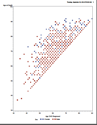
plot ageatdeath*agechddiag = sex ;
plot ageatdeath*ageatstart = sex ;
plot ageatdeath*mrw = sex ;
Title “Male ” ;
proc gchart data=sashelp.heart ;
vbar mrw / midpoints = (70 to 270 by 10) ;
where sex = “Male” ;
run ;
Title “Female ” ;
proc gchart data=sashelp.heart ;
vbar mrw / midpoints = (70 to 270 by 10);
where sex = “Female” ;
If I had more time, I would show all of these plots in one page – a draftman’s plot – but I’m running out to the airport in a minute. Maybe next time. Yes, I do realize these charts are probably terrible for people who are color-blind. Will work on that at some point also.
You can see that the age at diagnosis and death is linearly related. It seems there are many more males than females and the age at death seems higher for females.
You can see a larger picture here.
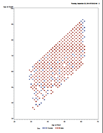
The picture with Metropolitan relative weight did not seem nearly as linear, which makes sense because if you think about it, age at start and age at death HAVE to be related. You cannot be diagnosed at age 50 if you died when you were 30.It also seems as if there is more variance for women than men and the distribution is skewed positively for women.
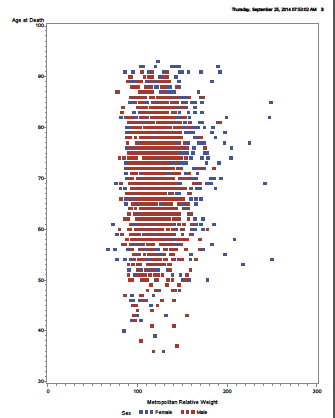
The last two graphs seem to bear that out, ( You can see those here – click and scroll down). which makes me want to do a PROC UNIVARIATE and a t-test. It also makes me wonder if it’s possible that weight could be related to age at death for men but not for women. Or, it could just be that as you get older, you put on weight and older people are more likely to die.
My point is that some simple graphs can allow you to look at your variables in 3 dimensions and then compare the relationships of multiple 3-dimensional graphs.
Gotta run – taking a group of middle school students to a judo tournament in Kansas City. Life is never boring.