Data Analysis by Example: That’s funny …
In the last post, I used SAS Enterprise Guide to filter out a couple of ‘bad’ records that came from test data, then I created a summary table of the number of questions answered and the percentage correct. Then, I calculated the mean percentage correct for the around 84%. That seemed a bit high to me.
Having (temporarily) answered the first question regarding the number of individual subjects and the average percent of correct answers from the 424 subjects, I turned to the next question:
Is there a correlation between percentage correct and the number of questions attempted? That is, do students who are getting the answers correct persist more often?
Since I had both variables, N and the mean correct (which, since this was score 0= correct, 1= incorrect gave me the percentage correct) from the summary tables I had created in the previous step, it was a simple procedure to compute the correlation.
I just went to the TASKS menu, selected MULTIVARIATE and then CORRELATIONS
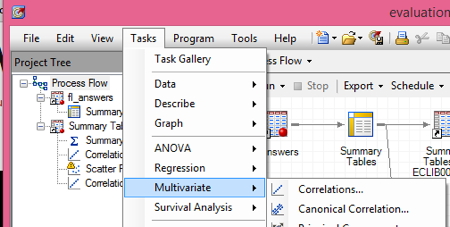
Under ANALYSIS VARIABLES correct_ N for the ‘correct’ variable, which is a variable that holds whether the student answered correctly, 0(= no) or 1(=yes). Under CORRELATE WITH I dragged correct_mean, which has the percentage each student answered correctly.
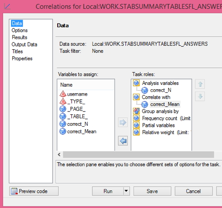 Since it is just a bivariate correlation and the correlation of X with Y = the correlation of Y with X , it would make absolutely no difference if I switched the spots where I dragged the two variables.
I click run and I get a somewhat unexpected result, you can see here, with a correlation of -.07.
I also note that the minimum number of answers attempted is 1. Now, I have done (and published) analyses of these data elsewhere, as this is an on-going project.
Other analyses from this same project can be found in:
Telling Stories with Your Data and
Because of these analyses of ‘Fidelity of Implementation’, that is the degree to which a project is implemented as planned, I am pretty sure that these data include a large proportion of students who only had the opportunity to play the game once.
So … I decided to run a scatter plot and check my suspicion. This is pretty simple. I just go to the TASKS menu and select GRAPH then SCATTER PLOT.
I selected 2-D Scatter Plot
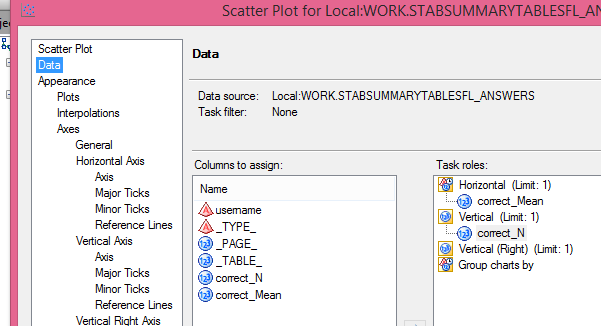
Then, I clicked on the DATA tab, dragged correct_Mean under Horizontal and Correct_N and vertical, then clicked RUN.
This produced the graph below.
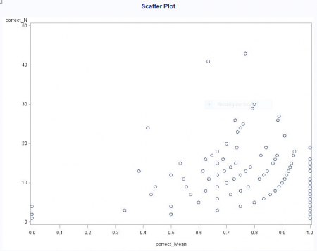 Now, this graph isn’t fancy but it serves its purpose, which is to show me that there IS in fact a correlation of mean correct and the number of problems attempted. Look at that graph a minute and tell me that you don’t see a linear trend – but it is pulled off by the line of 1.0 at the far end.
This did NOT fit my preconceived notion, though, that the lack of correlation was due to the players who played once, and so there would be a bunch of people who had answered 1 or 2 questions and got 100% of them correct. Actually, those 100-percenters were all over the distribution in terms of number of problems attempted.
This reminds me of a great quote by Isaac Asimov,
The most exciting phrase to hear in science, the one that heralds new discoveries, is not ‘Eureka!’ (I found it!) but ‘That’s funny …’
Well, we shall see, as our analysis continues …
Want to see these data at the source?

You can also follow the link above to donate a copy of the game to a school or give as a gift.
2 Comments